Ryan M. Maloney
Random Thoughts on Analytics, Programming, and Tech
If you are working with e-commerce data, or most data for online businesses for that matter, chances are you or your leadership spend a good deal of time compiling or looking at some sort of time series data. This data comes in a myriad of flavors; whether it is sales by day, sales by week, sessions by hour, sales by day/by category, these are the views that inform your team of your businesses performance over a set period of time. If you are working with data in e-commerce, it then follows that being able to quickly and effectively plot time series data becomes a very valuable skill. In this post, we’ll go over some reproducible examples of informative time series plots using R and ggplot2, in addition to explaining the logic behind them and how you could use them in your day to day work.
Let’s start with a pretty basic example. Assume we have a CSV file with two columns, a list of dates, and your site’s total overall sales for the day:

The first thing we’ll want to do is read in the data, and take a look at the data types as well as some summary statistics :
data<-read.csv("sales_by_day.csv", header = TRUE)

str(data)
summary(data)

Reviewing the output, we notice a few things. First, we can see that our site averaged about $520k worth of sales per day for the time frame covered in the data set. There’s also a bit of variance in our sales numbers. Our worst day was just over 100k, while the best day was about 964K. Second, we notice that R is treating the SALES_DATE field as a factor, instead of reading it as a date. So, we’ll want to convert the SALES_DATE field to a date to ensure that it is treated as such.

Now when we call str(data) we can see that the SALES_DATE field is being read as a date instead of a factor. So, it looks like we are all set. Now to get plotting:
plot<-ggplot(data=data, aes(x=data$SALES_DATE, y=data$DOLLARS)) + geom_line()

plot
The basic call to ggplot needs to tell it what data we are plotting (ours is called “data” in this case), as well as what aesthetics aes() to map it to. Here aesthetics is just a fancy word for telling ggplot how to structure the appearance of the plot. In the example above, we are telling it that the x avis should be the sales date, and the y axis should be dollars. It is critical to understand that this structure (mapping data sources to aesthetics) is a foundation for building plots in ggplot. Finally, after we have that set up we tell ggplot we’d want to use a line plot, so we add + geom_line() which specifies the type of plot we want to use.
There are three key ingredients in any ggplot plot:
-
- 1. A dataset to plot
-
- 2. A map of aesthetics that sets the layout/structure and other “aesthetic” details of the plot
- 3. A “geom” which is the shape/type of plot we want to use.
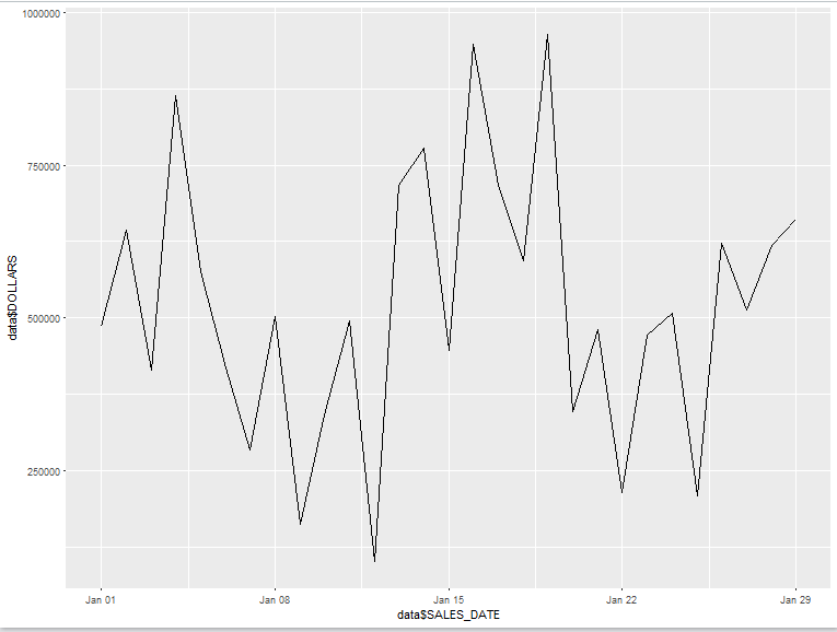
So with that one line of code, we get a barebones plot that helps us visualize the trend in sales over our time frame. Not a bad start, but there is certainly some room for improvement. For example, you’ll often want to break out sales data over a period of time by marketing channel or category. Before you simply just export your data and throw it into ggplot, its important to take some time and make sure that it’s in the proper shape and format for plotting. Oftentimes, you will need to reshape or “pivot” your data to get it into the correct layout that is appropriate for the plots or transformations you are trying to create. It goes without saying that data manipulation, cleaning, and transformation are one of, if not the most time consuming part of a data analysis project.
Fortunately, there are some fantastic libraries in R that do the legwork for you, allowing you to quickly manipulate and transpose your data without a ton of legwork. The most prominent example is the reshape library, which at its core gives you to functions, “melt” and “cast” to reshape and transform your datasets. A full walkthrough of how to use the reshape library with examples is probably outside of the scope of this article, but there are some really useful articles and tutorials on google. This PDF, by Wickham himself, is a great example. So although we won’t go too in depth with the reshape library here, I wanted to emphasize the importance of thinking about the appropriate layout for your data before plotting, as well as share some examples of how to use it to pivot and recast data.
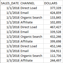
Moving on, let’s assume we have some time series data that features sales data by some other dimension (product category, marketing channel). Typically, you’ll want to have your data grouped by date along with the other dimension you are interested in:
Once the data is in order, you’ll want to think about how you’d like to visualize it. In the example above, one idea is to plot the trends for each marketing channel individually using facets. To accomplish this, we begin by following the same process as before – read in the data, build our plot object, map our aesthetics:
Once we have that, we expand on our plot object by adding on faceting, either through facet_wrap or facet_grid. The difference here is that facet_wrap
facet_grid(.~variable)
will return facets equal to the levels of variable distributed horizontally.
facet_grid(variable.~)
will return facets equal to the levels of variable distributed vertically.